
The Brand System
What it is, why it matters, and how the world's most considered brands keep theirs alive.

A NOTE ON THE REFERENCES
About the work shown in this document
This document discusses brand systems by reference to the agencies and brands that have shaped the discipline. Where the work of other companies is shown, it is reproduced for educational and commentary purposes only — to illustrate principles being discussed in the surrounding text.
All trademarks, logos, identity systems and brand assets shown remain the property of their respective owners. Their inclusion here does not imply any partnership, endorsement, or relationship with Katalyst Creative Agency. Each example is credited to the agency that produced it and the client that commissioned it.
Custom diagrams and Katalyst-branded illustrations in this document are original to Katalyst and may be used freely by clients of the agency.
INTRODUCTION
A brand is not a logo
The most repeated statement in the last 5 years when discussing anything to do with “Brand”. But for good reason.
The most expensive misunderstanding in commercial life is the belief that a brand is a logo. Some of the most valuable companies in the world — Apple, Nike, Mastercard, Spotify — spend tens of millions of dollars and years of senior leadership attention on something the average buyer assumes is a graphic design exercise. They do this because they understand what a brand actually is.
A brand is the sum of every signal a company sends and every impression an audience receives. It is the cumulative answer to the questions "who are you, what do you stand for, and why should I care?" — answered not in words but in thousands of moments: a homepage, a packaging design, a customer service reply, a sales conversation, an Instagram caption, the way an employee describes their job at a dinner party.
A brand system is the discipline that makes those thousands of moments feel like one thing.
The visible logo is roughly five percent of what a brand system actually is.
This document explains what a brand system is, where the idea came from, what the world's most considered agencies build today, what the investment requires from both sides of the table, and what it returns when it works. It is written for clients who are about to begin, are in the middle of, or are trying to manage the long life of a brand identity engagement — and want a clearer picture of what they are paying for and why.
01 — HISTORY
From mark to manual to operating system
A short history of the brand system
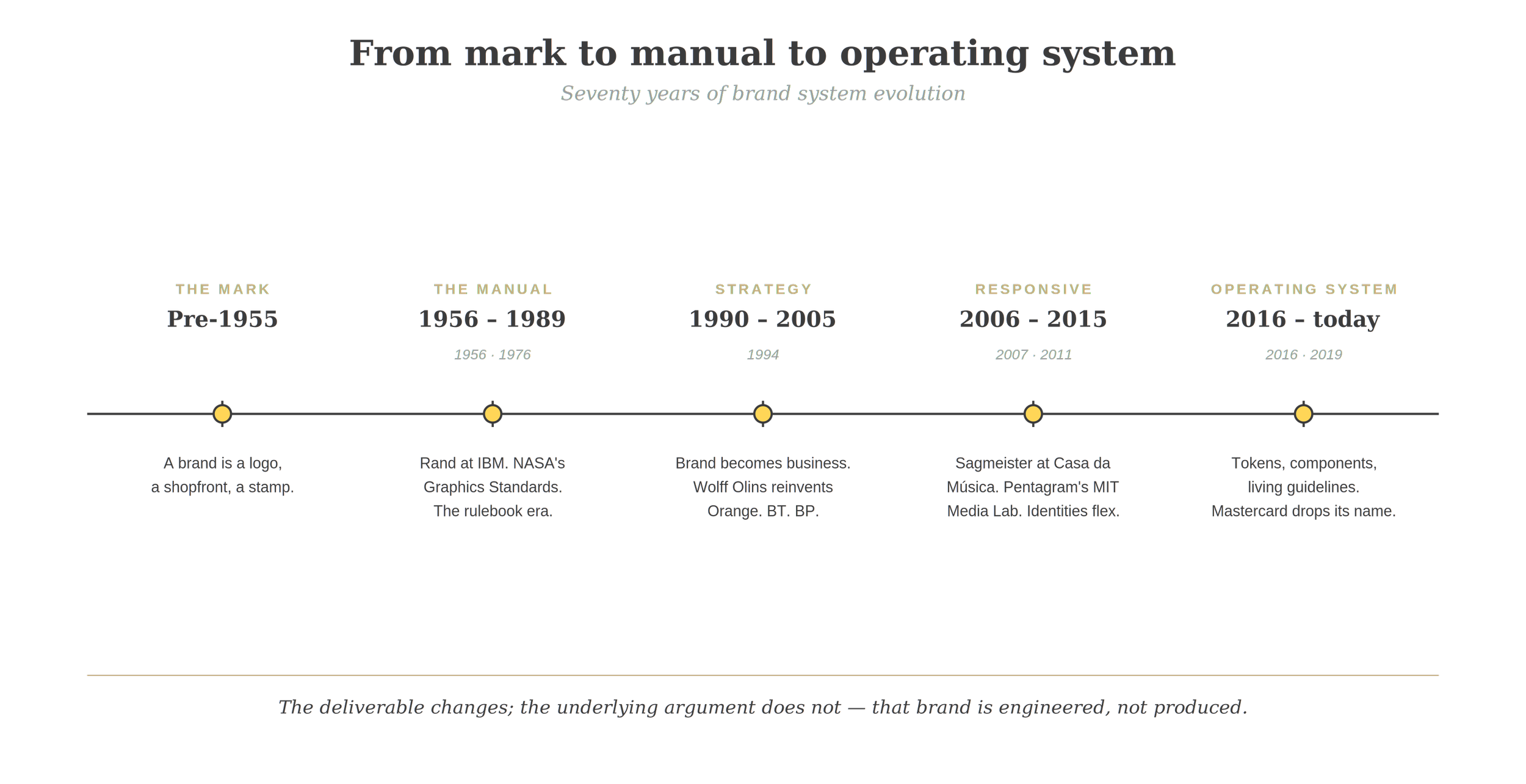
Five eras of brand thinking. Each one didn't replace the last — it absorbed it.
The idea that a brand is more than a logo is younger than most people assume. For most of commercial history, a brand was a literal mark — a stamp burned onto a barrel, a wax seal, an ornamental wordmark on a shopfront. The English word itself comes from the Old Norse brandr, meaning to burn.
The shift began in the postwar era. As corporations grew global and consumer markets matured, design became a strategic concern at the highest level. Paul Rand's identity work for IBM, beginning in 1956, treated the company's mark as the centre of a holistic visual program — typography, colour, layout, packaging and signage all governed by a coherent system. Saul Bass did the same for AT&T, Bell, and United Airlines. Massimo Vignelli's New York City Subway signage system in 1970 and the American Airlines mark in 1967 demonstrated that a system, applied with discipline, could organise the visual life of an entire institution.
By the late 1970s the brand standards manual had become the canonical deliverable. NASA's 1976 Graphics Standards Manual, designed by Danne & Blackburn, is the textbook example — a thick blue binder of rules covering every conceivable application of the agency's red "worm" logotype. This was the first heyday of brand systems: rigid, exhaustive, printed, and finite.
The 1990s reframed brand as strategy rather than decoration. Wolff Olins's 1994 launch of Orange, the UK telecoms brand, is a landmark — the firm wasn't drawing a logo, it was inventing an attitude. The same agency rebranded BT in 1991 and would later transform Beats, Tesco, Macmillan Cancer Support, and Uber. The discipline of brand began to absorb the language of behavioural science, organisational design, and management consulting.
The 2000s and 2010s broke the system open. Digital didn't just add a touchpoint — it dissolved the assumption that a brand could ever be "finished." Identities had to flex across screens of every size, contexts that hadn't been imagined when the system was built, and increasingly content created not by the agency or the client but by the audience itself. Pentagram's 2011 identity for the MIT Media Lab, designed by Michael Bierut and Aron Fay, generated forty thousand unique logo permutations algorithmically. Stefan Sagmeister's 2007 Casa da Música identity drew its colour palette dynamically from each event's poster image. The system itself became expressive.
Today we live in the age of the brand operating system. The deliverable is no longer a PDF manual. It is a living architecture — design tokens, component libraries, content models, AI guardrails, motion principles, sonic logos, and governance protocols — that powers everything from a banner ad to a chatbot to a pop-up retail store. Mastercard, redesigned by Pentagram's Michael Bierut in 2016 and refined again in 2019, removed its own name from its logo. Collins's 2017 Spotify rebrand and DesignStudio's 2014 Airbnb "Bélo" introduced the kit-of-parts model that now dominates.
A brand is not a logo. A brand system is the discipline that lets thousands of decisions, made by thousands of people, across thousands of moments, all feel like one thing.
02 — THE CANON
How the elite agencies think
Landor, Pentagram, Wolff Olins, Collins — and what they teach the rest of us
These four shops are not interchangeable. Each represents a distinct philosophy of what brand work is for. Understanding the differences is the fastest way to understand what a brand system needs to do.
Landor — the strategist
Founded in 1941 by Walter Landor on a converted ferry boat in San Francisco Bay, Landor built the modern corporate identity practice. Their work is defined by structural rigour and strategic depth. They treat brand as an asset to be managed across decades and balance sheets. The Landor playbook starts with research, market positioning, and competitive analysis; the visual system follows from a clear strategic mandate. Landor taught the industry that brand is a business decision before it is a design one.
FedEx. designed by Lindon Leader Landor · 1994.
The white-space arrow hidden between the E and the x is one of the most cited examples of strategic craft in identity design. It works because it is invisible until it is seen — a perfect symbol for a logistics company whose value is forward motion. The lesson Landor encoded here is that every visual decision should earn its place by carrying meaning, not just looking competent.
Pentagram — the craftsmen
Founded in London in 1972, Pentagram operates as a partnership of independent designers, each with their own team and clients, sharing only a name and a standard of work. Pentagram's identities are unified less by a house style than by an obsession with craft and clarity. Pentagram's lesson is that brand systems are won at the level of judgment. Rules can be codified; taste cannot.
Slack. rebrand from the original 2013 identity Pentagram (Michael Bierut) · 2019.
The original Slack mark — a colourful pinwheel of overlapping shapes — looked beautiful in isolation but fragmented disastrously when applied at small sizes, in different colours, or rotated. Pentagram's 2019 rebrand replaced sprawl with discipline: a simpler, more flexible mark and a coherent system that could finally hold together across the thousands of contexts the brand needed to inhabit. The lesson is that brand systems are tested not by their best applications but by their worst — and the most considered redesigns are usually about removing things, not adding them.
Wolff Olins — the brave
Founded in 1965 in London by Wally Olins and Michael Wolff, Wolff Olins is the brave one. Their work is defined by disruption and emotional ambition. Wolff Olins doesn't refine; it reinvents. Their internal vocabulary ("brave," "human," "transformative") signals their belief that brand should change how a company sees itself, not only how customers see it. Their lesson: the most valuable brand work happens internally before it ever shows up externally.

Orange. launch identity for Hutchison Telecom's mobile network Wolff Olins · 1994.
Wolff Olins didn't draw a logo for a telecoms company. They invented a brand that didn't behave like a telecoms company — warm, human, optimistic, named for a colour rather than a corporate parent. Within a decade Orange had become one of the most valuable telecoms brands in Europe. The lesson is that genuine repositioning requires the courage to abandon category conventions, and that the most lasting brand value comes from emotional ambition rather than visual refinement.
Collins — the expressive
Founded in New York in 2008 by Brian Collins, Collins is the youngest of the four and the most expressive. Their work pioneered the modern expressive brand system: bold colour, ambitious typography, generative illustration, motion as a primary element, and identities designed to be remixed by users and content teams without breaking. Collins's lesson is that the modern brand system has to be more than tolerant of creative chaos; it has to be powered by it.
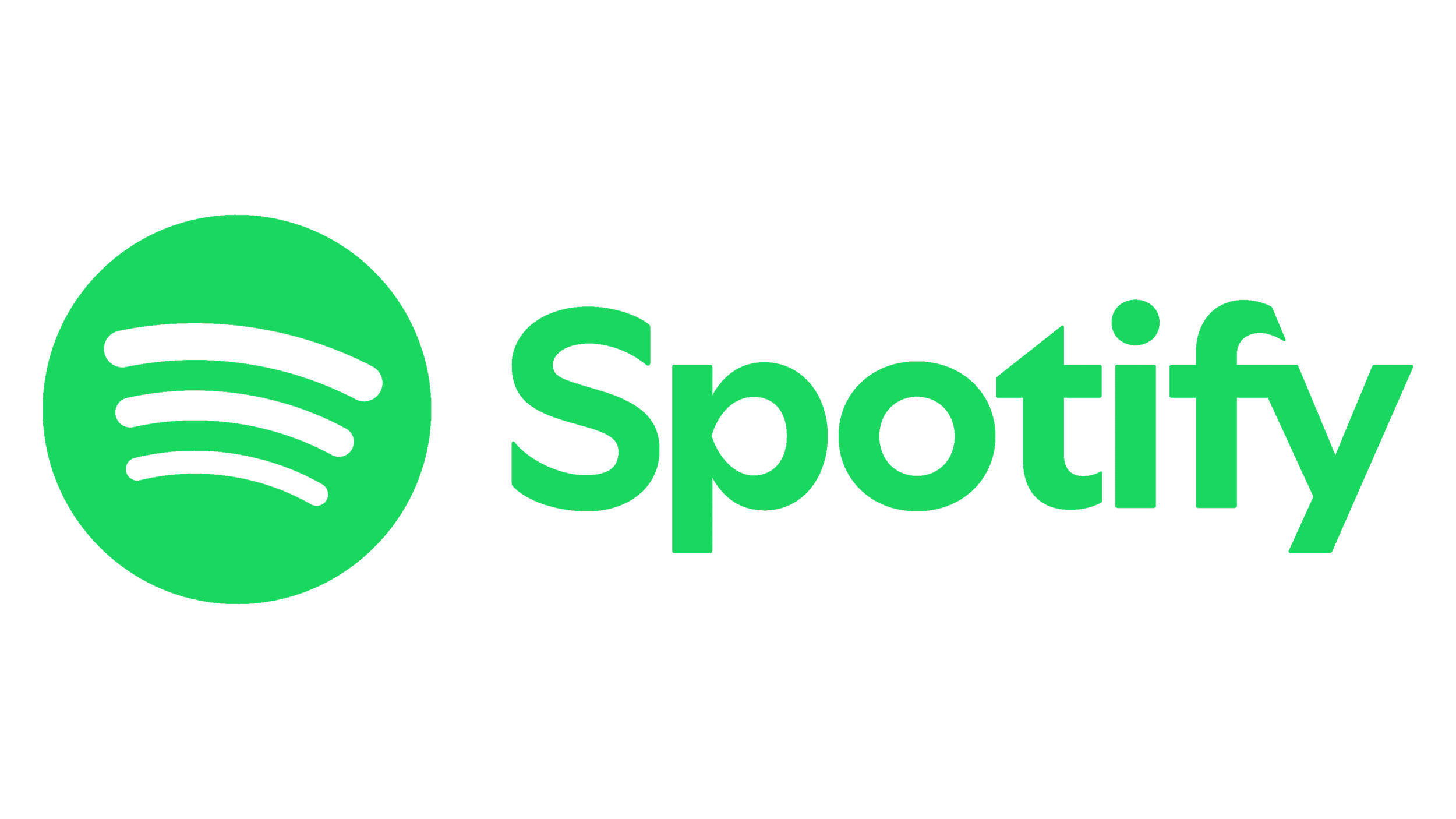
Spotify. expressive identity system and visual language Collins · 2017.
Spotify's 2017 system replaced a fixed visual identity with a generative one: high-contrast duotone treatments, bold typography, and rules for combining them that allowed the brand to express anything from grief to euphoria without ever feeling un-Spotify. Crucially, the system was designed to be applied not by a small in-house team but by hundreds of marketing partners and content creators worldwide. The lesson is that scale makes rigid systems impossible — and that the right answer is principled flexibility, not more rules.
The wider canon
Beyond these four, a wider canon informs serious brand practice. Chermayeff & Geismar & Haviv (the NBC peacock, Mobil, Chase, the Smithsonian, NatGeo). MetaDesign in Berlin and San Francisco. &Walsh (formerly Sagmeister & Walsh) for restless, expressive identity work. DesignStudio for the 2014 Airbnb Bélo, perhaps the most discussed rebrand of its decade. Moving Brands for systems thinking in motion. Saffron Brand Consultants for strategic depth on Vodafone and Bankia. Mucca for elegance in food, hospitality, and editorial. Each adds something to the discipline; none of them work alone.
What they all share is a belief that brand is not produced — it is engineered. A brand system is a piece of infrastructure.
03 — ANATOMY
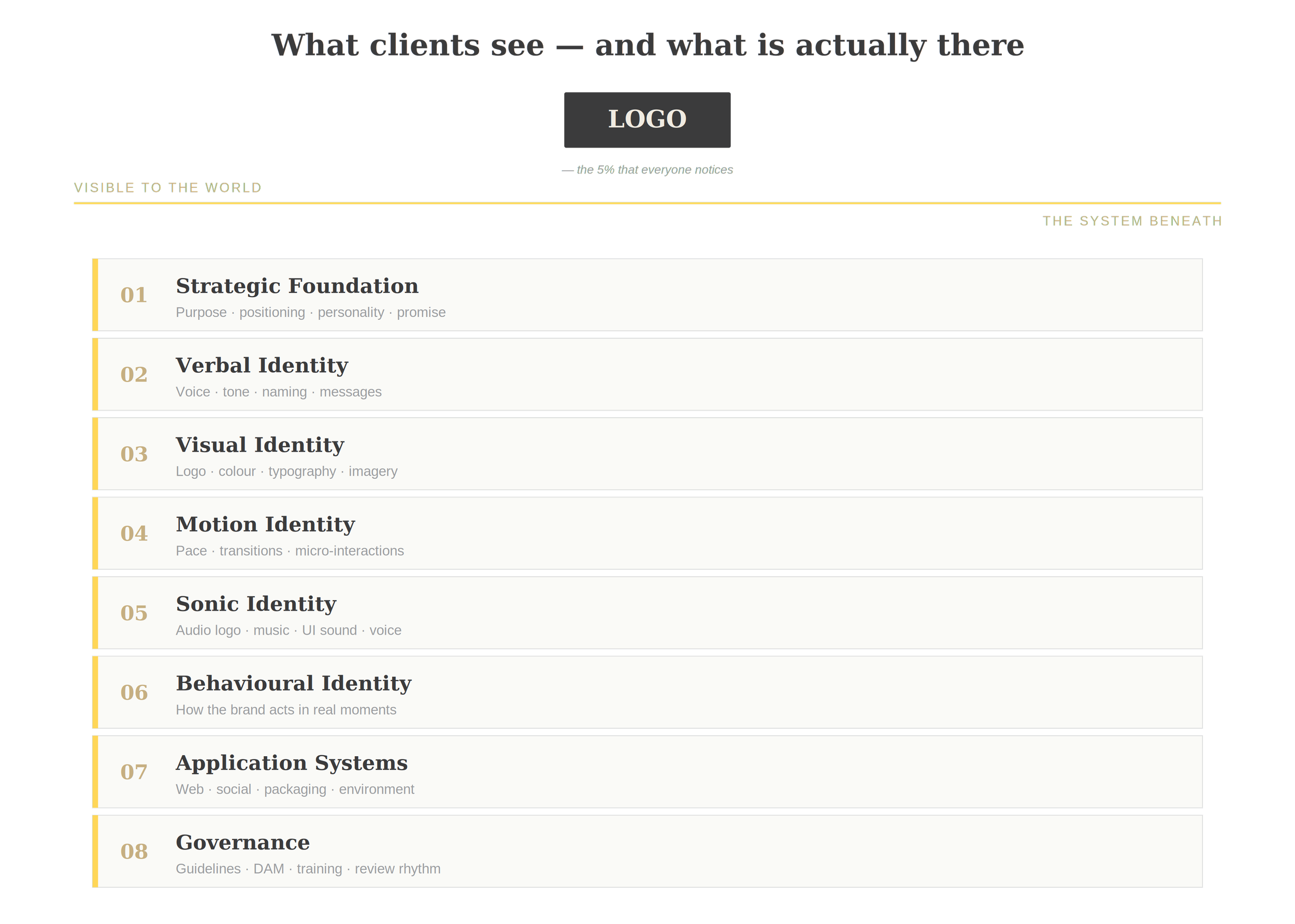
The eight layers
What a modern brand system actually contains
A modern brand system has roughly eight layers. Smaller brands compress them; larger brands break each into sub-systems with their own teams. But every serious brand system addresses all eight.
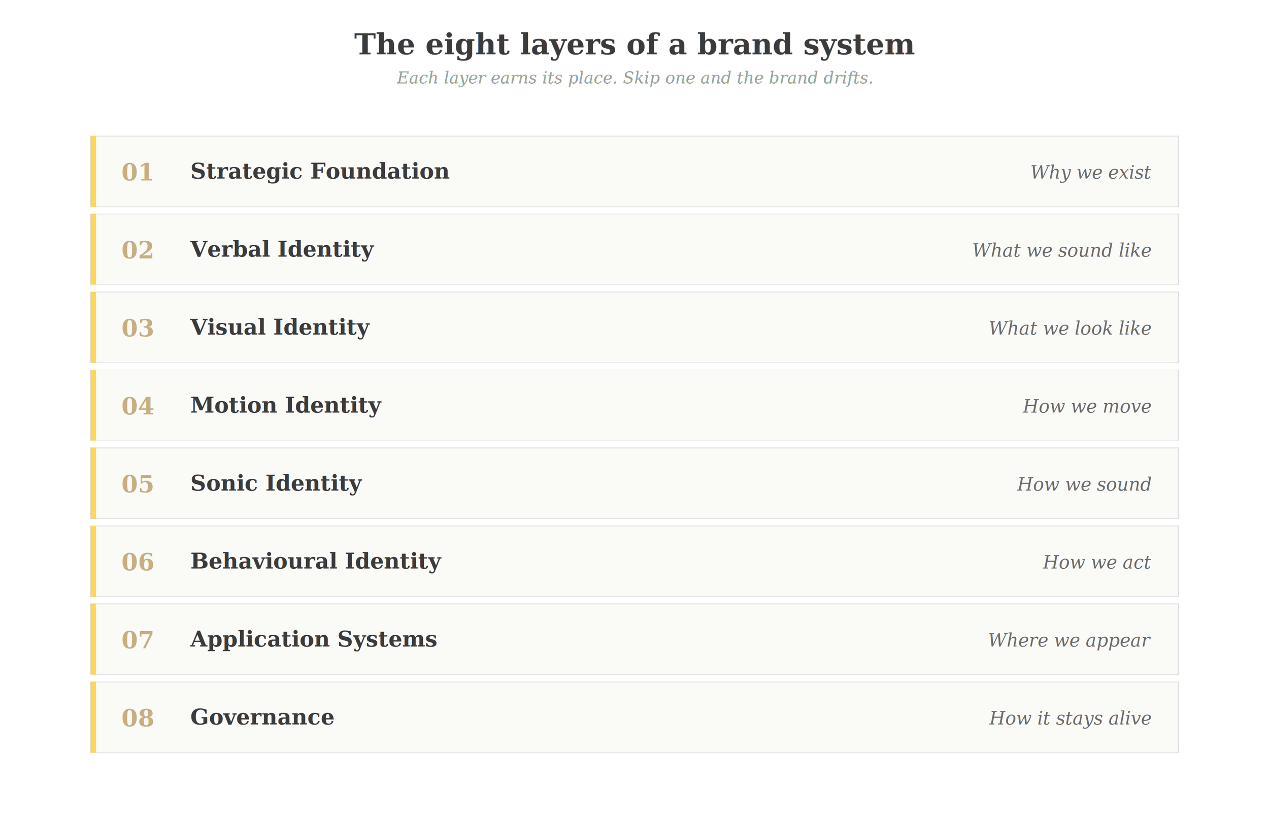
The eight layers. Skip one and the brand drifts within months.
Strategic foundation. Purpose, vision, mission, positioning, values, personality, brand promise, and the central brand idea. These are not decorative statements on a wall. They are decision-making tools. When a marketing manager asks "should we do X?" the strategic foundation is the document they consult to know whether X is on-brand.
Verbal identity. Naming architecture (parent brands, sub-brands, products), tagline or rallying cry, voice principles, tone modulation (a confirmation email reads differently from an Instagram caption), key messages, and editorial style. Done well, this is what makes a press release sound like the same brand as the homepage.
Visual identity. Logo system (primary mark, lockups, monograms, signatures), colour system (primary, secondary, tertiary, accessibility-tested combinations), typography system, photography direction, illustration style, iconography, graphic devices, layout principles, and grids.
Motion identity. How elements enter, transition, and exit. The pace and personality of animation. Loaders, micro-interactions, scroll behaviours. In a screen-first world, motion has gone from an afterthought to a core dimension of brand.
Sonic identity. Audio logos (think Mastercard's audio signature or Netflix's "ta-dum"), music direction, voice-over guidance, UI sounds. Increasingly relevant for any brand that will live in podcasts, video, voice interfaces, or in-store environments.
Behavioural and experiential identity. How the brand shows up in moments — a customer service interaction, an apology email, an onboarding sequence, a checkout flow, a physical event. The brand acts; this layer governs how.
Application systems. The scaffolding that translates the system into specific channels — web design system, social media templates, packaging architecture, retail and environmental design, signage and wayfinding, internal communications, sales collateral, advertising frameworks.
Governance. Guidelines (the modern equivalent of the brand book — usually a website, not a PDF), digital asset management, brand training and onboarding, approval workflows, exception protocols, and review rhythms. The discipline that keeps the system alive after launch.
A useful test: if any one of these layers is missing, the brand will eventually drift. The team that nails a beautiful logo but skips behavioural identity finds, six months in, that customer service replies sound nothing like the rest of the brand. The team that perfects messaging but skips application systems watches a regional sales deck, a paid ad, and a packaging design that all use the right colours and still feel like three different companies.
04 — BUILD
What goes into building one
The seven phases of a serious brand engagement
Building a brand system, done properly, follows a recognisable arc. Different agencies use different language, but the work is the same.

The arc of a brand engagement. Activation almost always weighs more than the rest combined.
Discovery. Stakeholder interviews, market and category audit, customer research, internal cultural diagnostic, audit of existing assets and historical brand expression. The goal is not to find an answer here; it is to find the real questions. Wally Olins of Wolff Olins used to say that most brand projects are won or lost in discovery.
Strategy. Synthesis of discovery into positioning, brand idea, personality, promise, and architecture. This is where the strategic foundation is built. It is the slowest phase per visible output and the highest leverage. Every later decision will be made or unmade here.
Creative concept. Multiple distinct creative directions, each rooted in the strategy but expressing it in different ways. Three to four directions is typical. The point of multiple directions is not "options to pick from" — it is triangulation. Seeing three directions reveals what each one is and isn't.
Identity and system design. The chosen direction is developed into a complete system. This is the longest production phase. Logo refinement, colour, typography, illustration, photography, motion principles, application explorations across the priority touchpoints.
Validation and stress-testing. The system is applied to deliberately difficult cases — the worst-case touchpoint, the smallest format, the most cluttered context, the unexpected use. A system that only works in beautifully composed mockups isn't a system; it's a moodboard. Stress-testing is what reveals what the rules actually need to be.
Documentation. Guidelines, components, tokens, training materials. The deliverable that lets the brand survive without the agency's daily involvement. Modern documentation is increasingly a website rather than a PDF — searchable, versioned, and constantly updated.
Activation and rollout. Launch strategy, internal communications, change management, phased application across touchpoints. This phase often costs more than every prior phase combined and is the one most underestimated by clients building their first system.
For a meaningful brand identity engagement — strategic foundation, complete visual system, rollout-ready guidelines — sixteen to twenty-six weeks is typical. For a full brand system serving a multi-product company with international reach, six to twelve months is normal. The largest engagements at Landor, Pentagram, or Wolff Olins routinely run a year or more.
05 — THE CLIENT SIDE
What it requires from the client
Six things money cannot buy
A brand system is a co-production. The agency brings craft, method, and outside perspective. The client brings six things without which no agency, however gifted, can do the work.
Executive sponsorship. A brand engagement that does not have the genuine, visible commitment of the most senior decision-maker will fail. Not might. Will. Brand work touches every part of a business; it cannot be owned by a marketing department alone.
Decision authority. Brand projects produce hundreds of decisions. Someone has to make them. Distributed decision-making — committees, broad stakeholder consensus, design-by-survey — produces compromised work. The most effective engagements have a clear, named decision-maker who can hold a position.
Access. To leadership. To customers. To frontline staff. To the data. To the brand's history. Agencies cannot solve problems they cannot see.
Honesty. Brand work surfaces uncomfortable truths — about the business, the leadership, the culture, the gap between aspiration and reality. The best engagements happen when clients can hear and respond to those truths without defensiveness.
Time. Real time. Time for stakeholders to participate. Time between presentations for the work to settle. Time to consult, gather feedback, and digest before deciding. Compressed timelines on brand work are usually paid for in quality.
Stewardship. When the development ends, someone inside the organisation has to own the brand. Not police it — own it. Champion it. Train new hires on it. Defend it from well-meaning departments that want to bend it for their objectives. Work with the agency to build it, now the work begins. The strongest brands in the world have strong internal brand custodians; the weakest have none.
06 — HOW IT WORKS
Rules, flexibility, and the kit of parts
How a modern brand system actually operates
The genius of the modern brand system is the resolution of an old tension: consistency versus expressiveness.
Old systems chose consistency. Every application followed a near-identical formula. The brand was recognisable but rigid. Boring, eventually.

Same elements, two philosophies. The new way looks different in every application — and stays unmistakably itself.
New systems collapse the tension by replacing rules with a kit of parts. The system defines a finite library of elements — colours, type, shapes, motion behaviours, illustration styles, image filters, sonic cues — and a set of principles for how they combine. Within those principles, an enormous range of expression is possible. The brand stays recognisable not because every application looks the same, but because every application is built from the same set of components.
Two of the most important examples in this discipline are unusual not because they were beautiful — many systems are beautiful — but because they treated identity as a generative engine rather than a fixed picture.
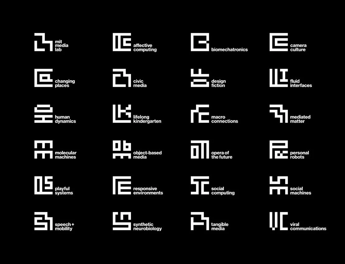
MIT Media Lab. generative identity system Pentagram (Michael Bierut, Aron Fay) · 2011.
Bierut and Fay built a system in which the Media Lab's logo was not a fixed mark but a set of rules. The geometry generated forty thousand unique logo permutations, allowing every researcher and group within the lab to have their own variant while still belonging unmistakably to the same parent brand. It was one of the first identities to treat algorithmic flexibility as a feature rather than a problem to be solved.
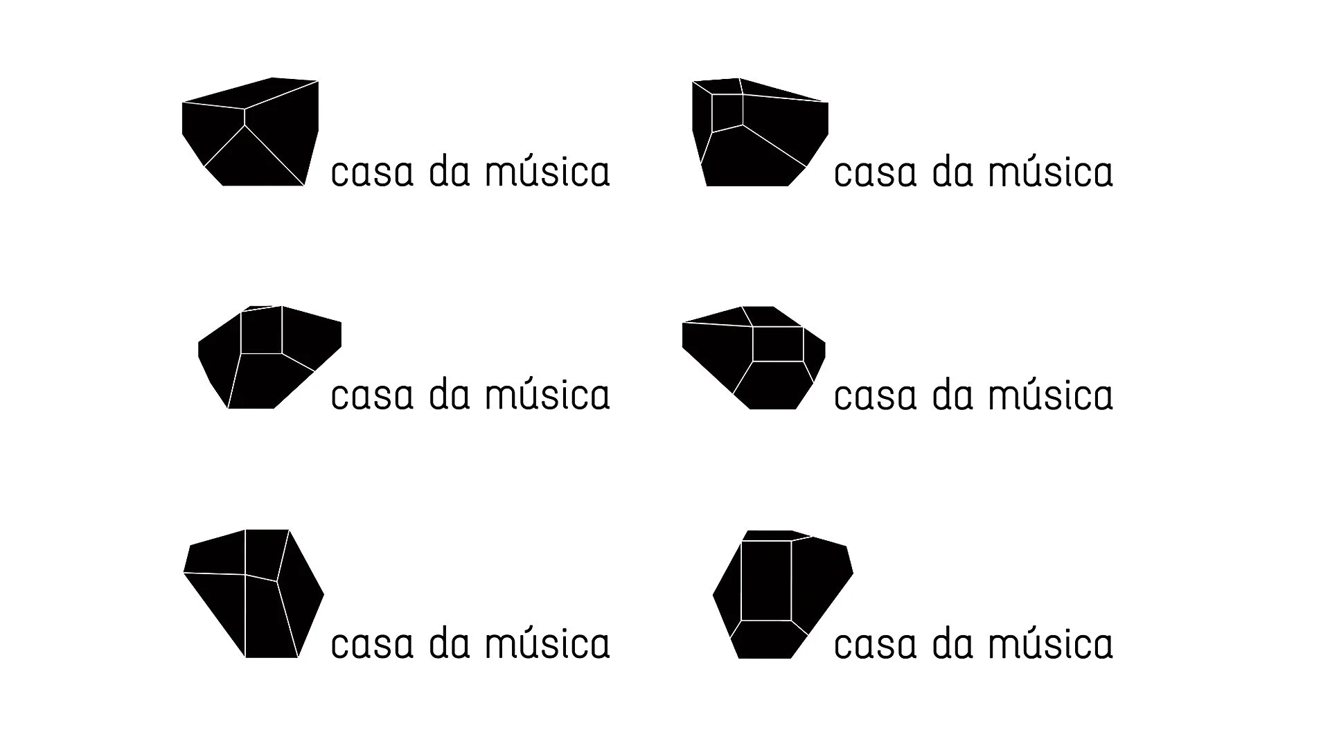
Casa da Música. responsive identity system Sagmeister Inc. · 2007.
Stefan Sagmeister derived the building's geometry into a logo that then sampled its own colour palette dynamically from each event's poster artwork. A jazz concert and a children's recital wore the same identity in entirely different colours, both unmistakably the institution. This was the first widely-discussed case of identity as response — the brand reacting to context rather than imposing on it.
Three principles make this work in practice.
Centralised governance, decentralised execution. A small core team owns the system. A wide periphery — designers, marketing teams, agency partners, content creators — applies it. The system is the contract between them.
Design tokens over design files. Modern systems express their rules as code-like tokens. A colour isn't "the gold"; it is a named, versioned token with a hex value, a contrast rating, and rules for combination. Tokens propagate across the entire ecosystem when changed, which is why brands now refresh in days rather than years.
Living guidelines, not printed manuals. A brand book in a PDF is dead the day it's published. A brand site, with searchable components, downloadable assets, embedded examples, and version history, is a living tool that the entire organisation actually uses.
The brand stays recognisable not because every application looks the same, but because every application is built from the same kit of parts.
07 — VALUE
Why this work is worth the investment
The return on a brand system, and what the evidence actually shows
Brand systems are expensive in time, attention, and money. The case for that investment is not folklore — it has been measured, repeatedly, by independent researchers analysing thousands of campaigns and hundreds of companies over decades. Three bodies of evidence are worth knowing about, because clients ask, and the answers should be more than "trust us, it works."
The Binet & Field finding (IPA, 2013)
Les Binet and Peter Field analysed 996 advertising effectiveness case studies from 700 brands across 83 categories, drawing on 30 years of IPA Effectiveness Awards data. Their central finding was that marketing operates on two distinct timescales: short-term sales activation, which decays quickly, and long-term brand building, whose effects compound. They categorised effects as short-term (up to one year), medium-term (one to two years), and long-term (three years and beyond), and found that the most effective campaigns allocate roughly 60 percent of budget to brand building and 40 percent to activation. The point most relevant for clients investing in a brand system: long-term growth is not produced by stacking short-term wins. It requires a different kind of investment, with a different time horizon.
The Ehrenberg-Bass finding (Sharp, 2010 onward)
Byron Sharp and the Ehrenberg-Bass Institute for Marketing Science, working from large-scale market data, identified three operational levers for brand growth: mental availability (how easily a brand comes to mind in buying situations), physical availability (how easily it can be bought), and distinctive brand assets (the colours, shapes, sounds, and signals that make a brand instantly recognisable). The relevance for brand systems is direct: distinctive assets become stronger memory cues over time only when they are applied with consistency. Inconsistent application doesn't just produce a weaker brand — it produces a brand that fails to grow because buyers can't reliably recognise it at the moment of purchase.
The McKinsey finding (2018)
McKinsey's "Business Value of Design" study tracked 300 publicly listed companies across consumer goods, medical technology, and retail banking over five years, scoring each on the McKinsey Design Index (MDI). Companies in the top quartile of design performance outpaced their industry peers by 32 percentage points in revenue growth and 56 percentage points in total returns to shareholders over the five-year period. The market disproportionately rewarded the top quartile; differences between the second, third, and fourth quartiles were marginal. Strong design — the kind a brand system makes possible — was a competitive advantage that compounded.
These three studies converge on the same point. Brand work is not decoration; it is a measurable driver of business outcomes, with effects that build over multi-year horizons rather than appearing in the next quarter's report.
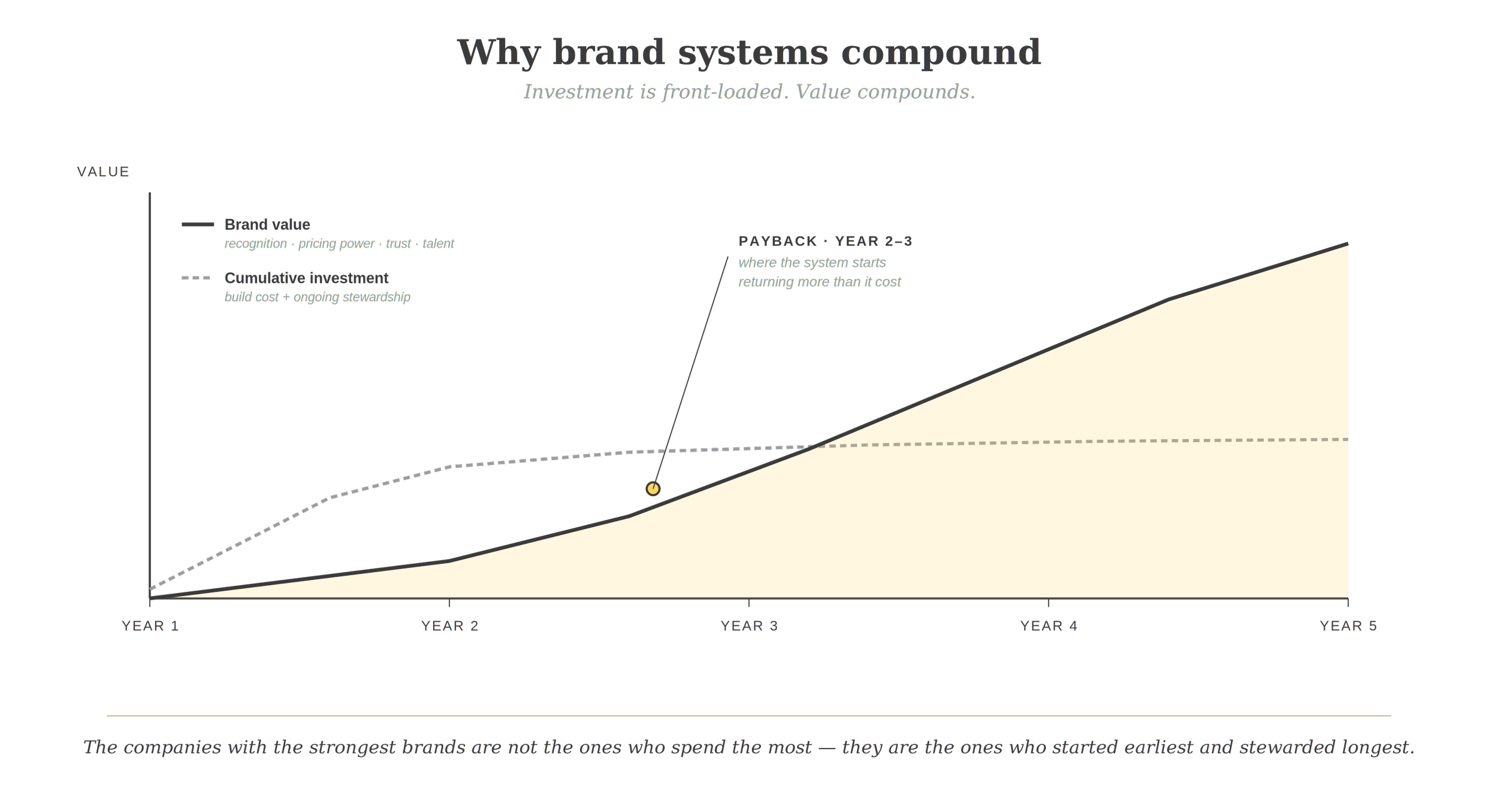
Brand value compounds. Investment is heaviest in year one; effects build through years two and three; the strongest evidence base measures payoffs over five years and beyond. (Curve illustrative; based on the time horizons reported in Binet & Field 2013 and McKinsey 2018.)
Seven categories of return, all observable in companies that have done the work seriously:
Cognitive efficiency. A coherent brand is faster to recognise, easier to remember, and quicker to choose. The Ehrenberg-Bass evidence on mental availability is the clearest empirical base — brands with consistent distinctive assets are bought disproportionately more often than their share of voice would predict, because they come to mind reliably at the moment of purchase.
Pricing power. Strong brands charge more for the same product. A premium-priced category leader is rarely premium because of product superiority alone; it is premium because the brand has earned the right to be. Binet and Field's data shows that brand-building campaigns produce significant long-term price elasticity effects that pure activation campaigns do not.
Trust velocity. Customers, partners, talent, investors — every audience makes faster decisions about brands they recognise and trust. A coherent brand reduces the friction in every relationship the business has.
Internal alignment. Brand work, done well, gives the organisation a shared language for what it is and is not. It makes hiring easier. It makes product decisions easier. It tells a sales team what to say when a client asks, "what do you actually stand for?"
Operational efficiency. A brand system means a hundred designers, agencies, and suppliers don't reinvent the wheel every time. A new piece of marketing takes hours, not weeks, because the system has already answered the foundational questions.
Resilience and growth readiness. A brand system is what allows a company to launch a new product, enter a new market, acquire another business, or pivot its strategy without losing its centre. The McKinsey research found this resilience showed up in shareholder returns over a five-year window, not just in marketing metrics.
Talent. Increasingly underrated. The strongest creative, engineering, and commercial talent want to work for brands they admire. A coherent, well-managed brand is a recruiting asset before it is a marketing one.
Sources cited in this section
Binet, L. & Field, P. (2013). The Long and the Short of It: Balancing Short and Long-Term Marketing Strategies. Institute of Practitioners in Advertising (IPA), London.
Sharp, B. (2010). How Brands Grow: What Marketers Don't Know. Oxford University Press. Research conducted at the Ehrenberg-Bass Institute for Marketing Science.
McKinsey & Company (2018). The Business Value of Design. Tracked 300 companies over five years; introduced the McKinsey Design Index (MDI).
08 — STEWARDSHIP
The brand system's first day is not its hardest day
How great brands are managed over time
The most common mistake clients make is treating a brand engagement as a one-time project. The system is built, the launch happens, the agency steps back, and the brand begins, slowly and then all at once, to fragment.
Brands that stay strong over decades — Apple, Nike, IBM, Mastercard, Spotify — share a discipline of ongoing management. Mastercard is perhaps the cleanest illustration of evolution done well.
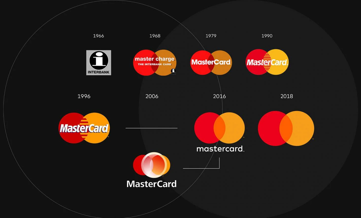
Mastercard. system evolution and symbol-only refinement Pentagram (Michael Bierut) · 2016 – 2019.
Pentagram's 2016 redesign streamlined Mastercard's iconic interlocking circles into a flatter, more confident system. Three years later, the agency made the move that signals genuine brand maturity: they removed the wordmark from the symbol entirely. Mastercard could now be represented by its two circles alone, in the same way Apple is represented by an apple and Nike by a swoosh. This is what stewardship looks like — not preserving the system in amber, but evolving it carefully so each change makes the brand stronger than it was. Crucially, Mastercard had spent years preparing for this moment, ensuring the symbol could carry the load before they let go of the name.
The discipline of ongoing management looks like this:
A named brand owner. A senior person with brand in their title and on their job description. Not "marketing." Not "communications." Brand.
A governance rhythm. Quarterly or semi-annual brand reviews. Audits of how the brand is being applied across regions, channels, and partners. Corrective action where needed.
Living guidelines. Updated continuously. Versioned. Maintained as a living tool, not a museum piece.
A digital asset management system. Where every piece of the brand lives, where it is searchable and downloadable, where the official version is unambiguous. The single source of truth.
Training and onboarding. Every new hire — not just creative team members — should encounter the brand in their first week. Sales, product, engineering, customer service, finance. The brand is everyone's job; the system has to teach that.
An evolution discipline. The system has to change. Markets shift. Categories mature. Brands age. The discipline is to evolve the system without breaking it. Mastercard's removal of its own name is the master class — a move years in preparation, executed only when the symbol could carry the load.
Honest measurement. Brand tracking. Awareness, consideration, preference, and emotional metrics. Not because brand can be reduced to numbers, but because the team needs to know whether the system is working.
The brand system is a piece of infrastructure. Like any infrastructure, it needs maintenance, monitoring, and occasional renewal. The agencies named in this document do not just build brand systems for clients — they often manage them for years afterwards, through retainer relationships that exist precisely because the work is never done.
CLOSING
One sentence
The shortest definition of a brand system is the one Wally Olins offered before any of this had a name:
a brand is the explicit promise an organisation makes to itself before it makes it to anyone else, of what it intends to be.
Everything in the system — every colour, every word, every motion principle, every governance protocol — exists to keep that promise.
All third-party trademarks, logos and identity systems shown remain the property of their respective owners and are reproduced for educational and commentary purposes only.